HOBBS: turning back time...


So after scrapping the idea to include a whole figure - it's about the shoes so we don't need to see the rest- I've decided to go for a simplistic style with simple lines and lovely thick drop shadows. I was inspired on finding some great Metropolis posters and reckon this with an Abram Games take on composition could look pretty sweet. Retro- check, chic- check, unfussy-check! Its also perfect to use for some great close-ups on the chunky heels and in conjunction with some 80's movie poster-style typography.


Time machine idea again a little refined but still in very early stages. This is still an option although I'm starting to think it'll look a little more archaic and won't scream 1980's. Which is kind of the point really...

This time machine sketch was born from the idea of transforming an old shoe from the 80's with the passing of time. I'm thinking ticking clocks, turning cogs, spinning wheels and hour glasses both in illustration and some sort of moving installation for the window display....


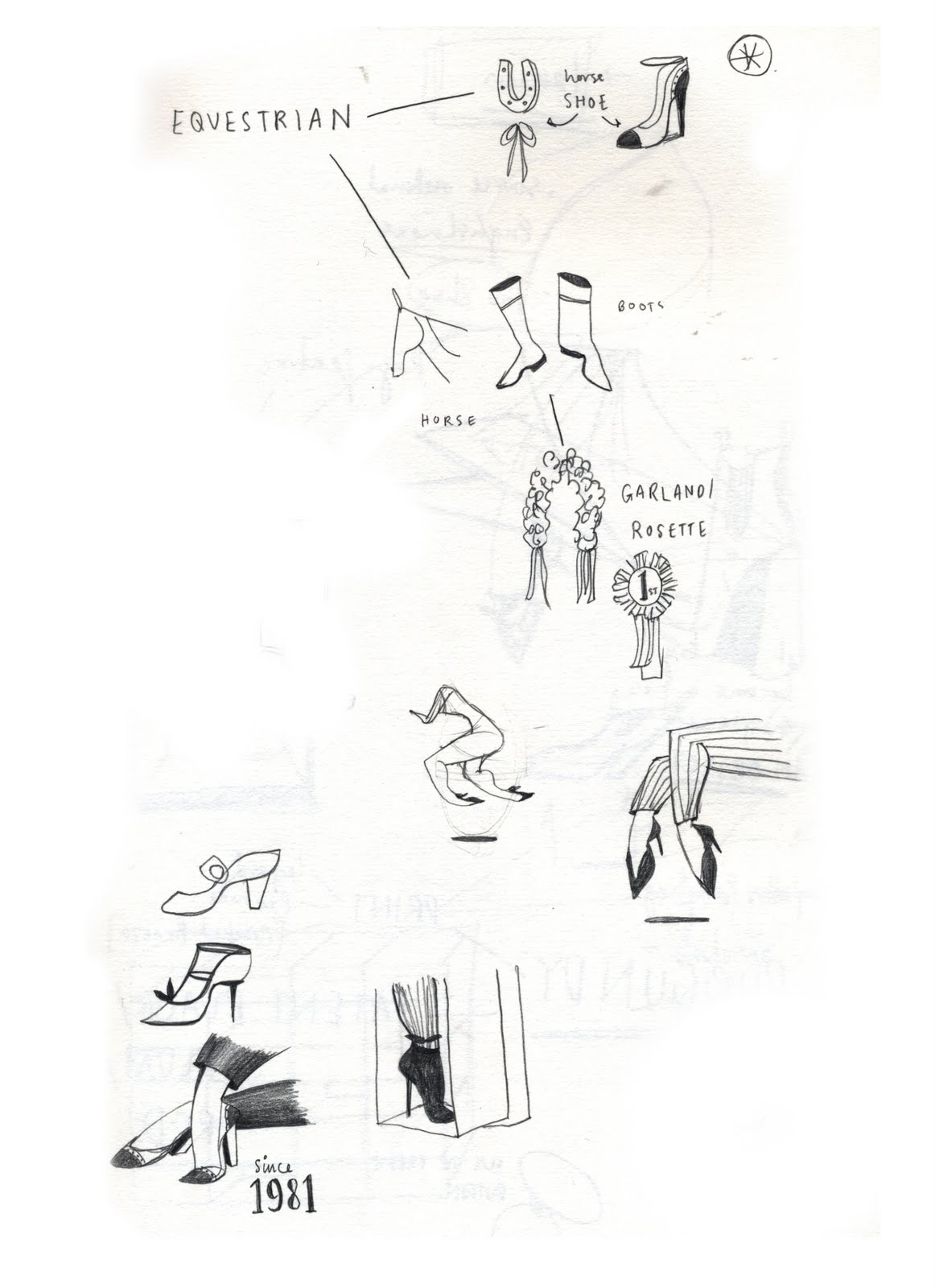
Apparently Hobb's love their circles. I try to please.


Developing a drawing technique here... i've got the calf and foot down to about two lines and a carefully placed squiggle...


These illustrations are taken from my latest sketchbook for a job for Hobbs. The brief is to launch the company's 30 year anniversary promotion where the designers have taken six shoes sold in the 1981 collection and reinvented them for today's Hobb's woman. Illustrations will be used for vinyls on window displays, swing tags for shoes, wallpaper, tissue paper. Above are some examples of working out how to best portray the elements of femininity, classic elegance, and Britishness (all things Hobb's are known for) as well as reflecting the idea that the company is celebrating its birthplace in the 80's. Fun project. Plus shoes are utterly fab.


Comments
Post a Comment